 I began collecting Alex Steinweiss album covers before I even knew who he was. All I knew is I had these really cool old albums that made brilliant use of typography and color. Then I found For The Record: The Life and Work of Alex Steinweiss by Jennifer McKnight-Trontz, Alex Steinweiss and Steven Heller and I finally had a name to put with this brilliant work.
Working as an art director for Columbia Records in 1939, he invented a seemingly obvious idea -- the illustrated album cover. Although this form of product packaging seems obvious today, it was a great breakthrough back then. Sales of albums with Steinweiss covers sold much better than those without. One reissue of Beethoven's Ninth Symphony saw sales increase 847 percent in the six months after it was issued with a Steinweiss cover versus the six months before when it had a traditional "tombstone" cover. Later, with the advent of the 33 rpm record, he helped invent the cardboard album sleeve we know today.
Although he later left Columbia, he went on to design covers for the London, Decca and Everest labels. During his heydey from 1939 to the mid-1950s, he designed some of the most unique album covers ever using typography, color and illustrations.
This is a good example of one of his early album covers. Fletcher Henderson was only one of the jazz greats that Steinweiss designed covers for. Louis Armstrong, Count Basie, Duke Ellington and Benny Goodman albums also received the Steinweiss treatment.
This Larry Adler album has a Russian constructivist feel. Notice how the type is arranged and how the hands are in white.
This Frankie Carle album is one of the best-known examples of his work. Because offset printing was still new (and very expensive), Columbia printed its covers by letterpress, which limited Steinweiss to three or four flat colors and two plates of halftone. Steinweiss made the most of these limitations.
This one is almost Abstract Expressionistic, with hints of Picasso and Pollock. Pink and gold and black? Very bold.
He wasn't just a master of typography. He was also a master illustrator.
One distinctive feature of a Steinweiss album cover was use of the handwriting font he developed: Steinweiss Scrawl. You can see it on the covers below. It's the curly cursive writing. This grew out of his need to meet tight deadlines by using handlettering.
Steinweiss Scrawl was used by other Columbia designers, too. This album may not be a Steinweiss, even though it uses the Scrawl font. Steinweiss didn't often use photographs, and the typography isn't as dynamic as his other covers. Still, it's a beautiful two-color cover.
Black, gray and pink. Very MCM.
Love the can-can girl.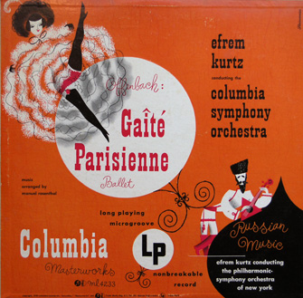
Another nice two-color effort.
Alex Steinweiss is still alive and living in Florida.
Alex Steinweiss Resources
Wednesday, May 9, 2007
An Appreciation: Alex Steinweiss
Posted by
Steve
at
7:01 AM
![]()
Labels: Album Covers, Alex Steinweiss, graphic design
Subscribe to:
Post Comments (Atom)

No comments:
Post a Comment